Team:KIT-Kyoto/DesignNote/Week1
From 2010.igem.org
(Difference between revisions)
Matsubara3 (Talk | contribs) |
|||
| (8 intermediate revisions not shown) | |||
| Line 11: | Line 11: | ||
</head></html> | </head></html> | ||
{{Template:KIT-Kyoto/menu}} | {{Template:KIT-Kyoto/menu}} | ||
| - | + | <table border=0 width="965px" align="center"><tr><td> | |
| - | <table | + | <div aling="left">[[Team:KIT-Kyoto/Home|Home]] > [[Team:KIT-Kyoto/Note|Notebook]] > [[Team:KIT-Kyoto/DesignNote|Design Note]] > [[Team:KIT-Kyoto/DesignNote/Week1|Week1]]</div></td><td><div align="right">Language : [[Team:KIT-Kyoto/DesignNote/Week1|English]] / [[Team:KIT-Kyoto/DesignNote/Week1J|Japanese]]</div></td></tr></table> |
| - | [[Team:KIT-Kyoto|Home]] > [[Team:KIT-Kyoto/Note|Notebook]] > [[Team:KIT-Kyoto/DesignNote|Design Note]] > [[Team:KIT-Kyoto/DesignNote/Week1|Week1]]</div></td></tr></table> | + | <table border=0 width="965px" align="center"><tr><td width="165px" valign="top" align="left"><div>{{Template:KIT-Kyoto/menu12}} |
| - | + | ||
| - | <table border=0 width="965px" align="center"><tr><td width="165px" valign="top" align="left"><div> | + | |
| - | + | ||
| - | {{Template:KIT-Kyoto/menu12}} | + | |
</div></td><td width="800px" valign="top" align="left"><div id="MIGI"> | </div></td><td width="800px" valign="top" align="left"><div id="MIGI"> | ||
== Team Logo Design == | == Team Logo Design == | ||
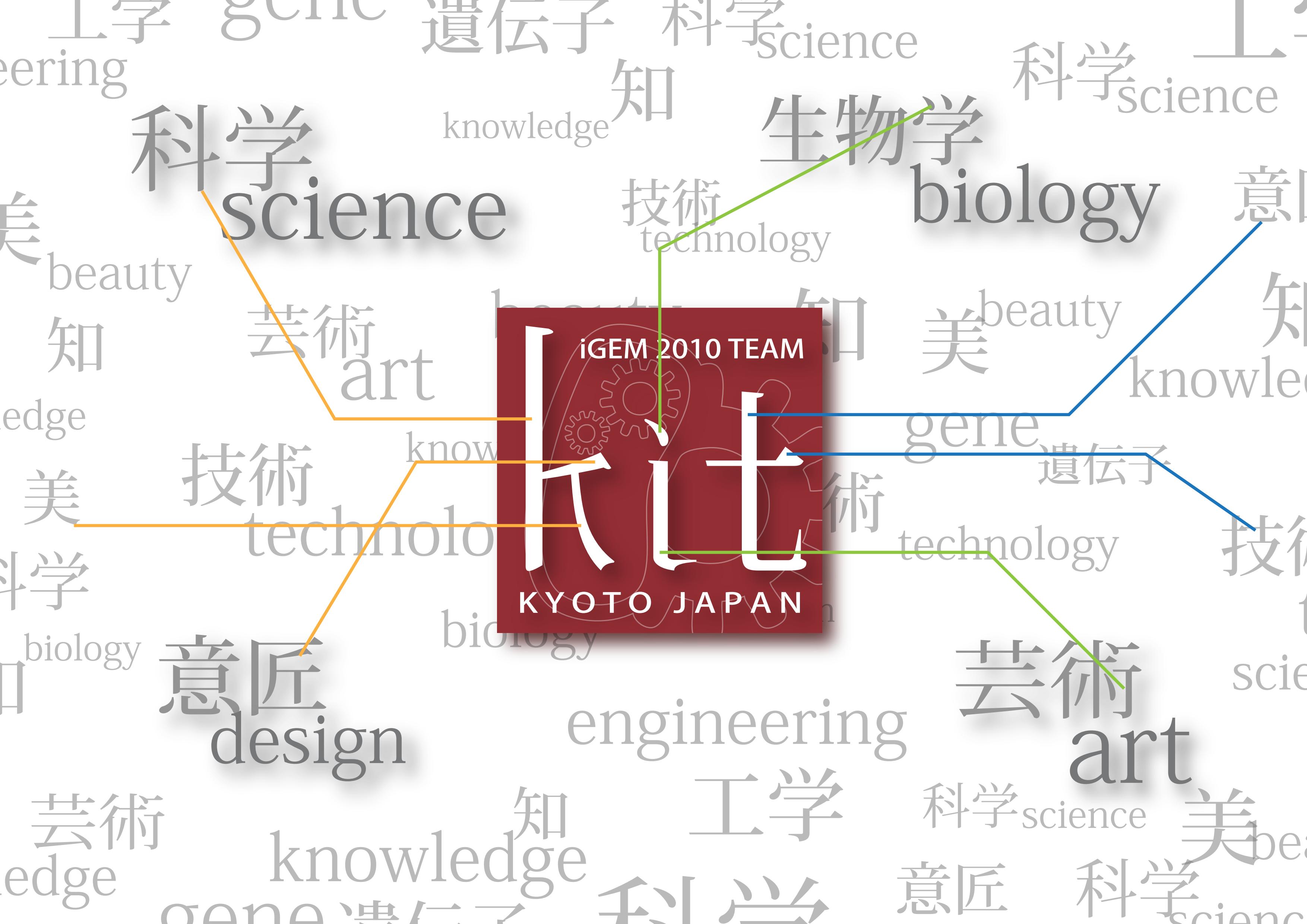
| - | + | We have figured out a Logo that symbolizes the multidisciplinary character of our work and our institution. It has been figured out inspired in Japanese language ideograms, "kanji",which are familiar to Japanese people. The image as a whole reflects Japanese aeshetics.and is written with strokes proper to Japanese written language.The logo shows the official name of our group "KIT" in lower case letters to represent in a simple way the identity and character of our group. The important issue is not | |
| - | + | to memorize its official name, but identifying and keeping in the memory the group by associating the faces of our group with the logo mark.We have tried the logo image to reflect a bit of the Japanese mind mainly the smartness and delicacy.... | |
| - | + | ||
<BR><BR> | <BR><BR> | ||
[[Image:KitlogoMaking.jpg|800px]] | [[Image:KitlogoMaking.jpg|800px]] | ||
| - | + | == Trial == | |
[[Image:KIT003.png|350px]] | [[Image:KIT003.png|350px]] | ||
| Line 37: | Line 32: | ||
| - | + | ||
| + | |||
{{Template:KIT-Kyoto-1}} | {{Template:KIT-Kyoto-1}} | ||
Latest revision as of 15:34, 26 October 2010
 
|
Language : English / Japanese |
 "
"


